


Romic: Data Structures and EDA for Genomics
08 May 2022Romic is an R package, which I developed, that is now is now available on CRAN. There is already a nice README for romic on GitHub and a pkgdown site, so here, I will add some context regarding the problems this package addresses.
The first problem we’ll consider is that genomics data analysis involves a lot of shuffling between various forms of wide and tall data and incrementally tacking on attributes as needed. Romic aims to simplify this process, by providing a set of flexible data structures that accommodate a range of measurements and metadata and can be readily inter-converted based on the needs of an analysis.
The second challenge we’ll contend with is decreasing the time it takes to generate a plot so that mechanics of plotting rarely interrupt the thought process of data interpretation. Building upon romic’s data structure, the meaning of variables (feature-, sample-, measurement-level) are encoded in a schema, so they can be appropriately surfaced to filter or reorder a dataset, and add ggplot2 aesthetics. Interactivity is facilitated using Shiny apps composed from romic-centric Shiny modules.
Both of these solutions increase the speed, clarity, and succinctness of analysis. I’ve developed and will continue to refine this package to save myself (and hopefully others!) time.
While, romic is discussed in the parlance of genomics, romic’s data structures are useful for any moderately sized feature-level data, and its interactive visualizations can be used for any data with dense continuous measurements. Because of its generality, romic serves as a useful underlying data structure that can be combined with application-specific schemas and methods to create powerful, succinct workflows. One such application that I’ll discuss in a future post, is the claman R package which builds upon romic to create an opinionated workflow for mass spectrometry data analysis.
Data Structures for Genomics
Conventional Formatting
Datasets in genomics are often generated and shared in wide formats (one row per gene, one column per sample), often with extra rows and columns added for feature and sample metadata. At first blush this is a good format, because it supports both folks who want to work with a matrix-level dataset as well as individuals who are interested in specific genes.
That said, to manipulate and visualize such data requires integrating metadata with measurements. For example, when correcting for batch effects we often want to incorporate sample-level information, such as the date samples were collected. Combining numeric measurements with categorical and numeric meta-data is awkward in matrices. One could do this with attributes, but generally we would just maintain separate tables for samples, and features, since each variable in a table can have its own class. A benefit of this approach is that working with matrices can be very fast, while the major downsides are having to maintain multiple similar versions of a dataset, and needing to be careful about maintaining the alignment of measurements, features, and samples.
Romic’s Tabular Representations
An alternative to manipulating matrices is to work fully with tabular data. This mode of operation is very similar to working with SQL, allowing us to maintain a complex, yet organized dataset. Using tabular “tidy” data also allow us to tap into the expansive suite of tools in the tidyverse. Working with features, samples, and measurements tables allow us to separately modify each table, while the three tables can be combined (using primary key - foreign key relationships) if we need to add sample- or feature-level context to measurements.
Romic provides two data structures, a triple_omic and a tidy_omic class for representing these two scenarios. These formats can be used interchangeable in romic’s functions by treating them as a T*omics (tomic) meta-class. Most exported functions from romic, take a tomic object which means they can convert to whatever format makes most sense for a function under the hood and then return a triple_omic or tidy_omic object depending on the input type.
Using a schema, tables can be combined and then broken apart again without constant guidance, and validators quickly flag data manipulation errors (such as non-unique primary keys, or measurements of the same sample with different sample attributes).
By taking care of many of the joins and reshaping operations that we may have to do, romic helps to simplify analyses while avoid common data manipulation errors. It directly supports dplyr and some ggplot operations, while data can also be easily pulled out of the romic format (and then added back if desired) based on users’ needs.
Exploratory Data Analysis for Genomics
To demonstrate how easily romic can be used for formatting and exploratory data analysis we can reanalyze and existing dataset.
Following a tradition set by Dave Robinson of teaching statistical analysis of genomics data using yeast microarrays (link), I generally teach statistical genomics with the Brauer et al. 2008 dataset and this study formed the basis of romic’s vignette and examples. To expand this theme, here we can look at another old-school yeast expression dataset. This one has over 5,500 citations!
In Gasch et al. 2000 the authors explored how yeast expression depends on a range of stressors. Gasch2K revealed that regardless of the nature of a stressor, yeast tend to respond to the threat with a relatively stereotypical gene expression response termed the “environmental stress response” (the ESR).
David Botstein (the senior author of both of both the Brauer and Gasch papers) describes the logic behind the ESR with a Star Trek-themed analogy. The idea is that when the Starship Enterprise is cruising along, most power goes to the engine. But, when the Enterprise is under attack (whether from Klingons, Romulans or asteroids) power needs to be redirected to the shields to combat the threat. Cells follow this “shields up and shields down” growing fast when conditions are good and hunkering down when they are not. An interesting corollary of this behavior is that when facing one stress (such as desiccation), cells will simultaneously become more resistant to other stressors (such as heat shock).

While humans have more complicated stress sensing pathways than yeast, the mammalian equivalent of the ESR, termed the integrated stress response (ISR), still serves an important role in sensing and responding to diverse stresses. Modulating this pathway is being actively explored as an anti-aging/disease therapy by Calico, Denali and Altos.
Data Loading
In what can only be described as par for the course in bioinformatics, while writing this post the Stanford site that was hosting Gasch2K was down requiring me to obtain the dataset using Wayback Machine. Having moved the dataset to my site (hosted on GitHub pages) we can read it directly from a url.
# environment setup
library(dplyr)
suppressPackageStartupMessages(library(ggplot2))
# install from CRAN with install.packages("romic)
# right now its probably better to install the dev version from GitHub
# with remotes::install_github("romic)
library(romic)

gasch_2000 <- readr::read_tsv(
  file = "https://www.shackett.org/files/gasch2000.txt",
  col_types = readr::cols() # to accept default column types
  )
gasch_matrix <- gasch_2000 %>%
  select(-UID, -NAME, -GWEIGHT) %>%
  as.matrix()
rownames(gasch_matrix) <- gasch_2000$UID

# output
dim(gasch_matrix) %>% {c("rows" = .[1], "columns" = .[2])} %>% t() %>%
knitr::kable() %>% kableExtra::kable_styling(full_width = FALSE)| rows | columns |
|---|---|
| 6152 | 173 |
Process metadata
To interpret any of the patterns in this dataset, we’ll need some metadata describing both the measured genes and samples.
Genes
Genes are frequently summarized using Gene Ontology (GO) terms that capture their sub-cellular localization (CC), molecular function (MF) or biological process (BP). These are typically one-to-many relationships where a given gene will belong to multiple GO terms in each of three ontologies. The GO slim ontologies used here are a curated subset of GO terms which map each gene to a single BP, MF and CC term. These ontologies are convenient for the kind of quick data slicing and inspection but we would be better off with the full ontologies for systematic approaches like Gene Set Enrichment Analysis (GSEA).
goslim_mappings <- readr::read_tsv(
    "https://downloads.yeastgenome.org/curation/literature/go_slim_mapping.tab",
    col_names = c("ORF", "common", "SGD", "category", "geneset", "GO", "class"),
    col_types = readr::cols()
  ) %>%
  select(-GO) %>%
  group_by(ORF, category) %>%
  slice(1) %>%
  tidyr::spread(category, geneset) %>%
  select(
    ORF, common, SGD, class,
    cellular_compartment = C,
    molecular_function = F,
    biological_process = P
  ) %>%
  ungroup()

feature_metadata <- gasch_2000 %>%
  select(UID) %>%
  left_join(goslim_mappings, by = c("UID" = "ORF"))

knitr::kable(feature_metadata %>% dplyr::slice(1:5))| UID | common | SGD | class | cellular_compartment | molecular_function | biological_process |
|---|---|---|---|---|---|---|
| YAL001C | TFC3 | S000000001 | ORF|Verified | mitochondrion | DNA binding | biosynthetic process |
| YAL002W | VPS8 | S000000002 | ORF|Verified | CORVET complex | enzyme binding | endosomal transport |
| YAL003W | EFB1 | S000000003 | ORF|Verified | eukaryotic translation elongation factor 1 complex | enzyme regulator activity | biosynthetic process |
| YAL004W | NA | S000002136 | ORF|Dubious | cellular component | molecular function | biological process |
| YAL005C | SSA1 | S000000004 | ORF|Verified | cell wall | ATP hydrolysis activity | biosynthetic process |
Samples
Working with a fresh dataset invariably involves some data munging to format data and metadata in a usable format. In the case of the Gasch2K dataset, organizing samples was the most painful part of this process. Gasch2Ks samples are identified with short irregularly formatted names so it requires a bit of work to organize them. We could address this problem with a manually curated spreadsheet (I generally use tibble::tribble() for small tables and Google Sheets for larger ones). Luckily, the samples here are still organized enough that we can programmatically summarize them. Samples are defined in two ways: first, by the type of stressor (e.g., heat, starvation, …) and second, by the severity of the stressor. Within each stressor, samples are typically arranged in order of increasing stress. With this setup, we can capture each stressor using regulator expressions (since there are inconsistencies in the data, such as “diauxic” and “Diauxic”).
library(stringr)

experiment_labels <- tibble::tibble(sample = colnames(gasch_matrix)) %>%
  mutate(experiment = case_when(
    str_detect(sample, "hs\\-1") ~ "Heat Shock (A) (duration)",
    str_detect(sample, "hs\\-2") ~ "Heat Shock (B) (duration)",
    str_detect(sample, "^37C to 25C") ~ "Cold Shock (duration)",
    str_detect(sample, "^heat shock") ~ "Heat Shock (severity)",
    str_detect(sample, "^29C to 33C") ~ "29C to 33C (duration)",
    str_detect(sample, "^29C \\+1M sorbitol to 33C \\+ 1M sorbitol") ~ "29C + Sorbitol to 33C + Sorbitol (duration)",
    str_detect(sample, "^29C \\+1M sorbitol to 33C \\+ \\*NO sorbitol") ~ "29C + Sorbitol to 33C (duration)",
    str_detect(sample, "^constant 0.32 mM H2O2") ~ "Hydrogen peroxide (duration)",
    str_detect(sample, "^1 ?mM Menadione") ~ "Menadione (duration)",
    str_detect(sample, "^2.5mM DTT") ~ "DTT (A) (duration)",
    str_detect(sample, "^dtt") ~ "DTT (B) (duration)",
    str_detect(sample, "diamide") ~ "Diamide (duration)",
    str_detect(sample, "^1M sorbitol") ~ "Sorbitol (duration)",
    str_detect(sample, "^Hypo-osmotic shock") ~ "Hypo-Osmotic Shock (duration)",
    str_detect(sample, "^aa starv") ~ "Amino Acid Starvation (duration)",
    str_detect(sample, "^Nitrogen Depletion") ~ "Nitrogen Depletion (duration)",
    str_detect(sample, "^[Dd]iauxic [Ss]hift") ~ "Diauxic Shift (duration)",
    str_detect(sample, "ypd-2") ~ "YPD (duration)",
    str_detect(sample, "ypd-1") ~ "YPD stationary phase (duration)",
    str_detect(sample, "overexpression") ~ "TF Overexpression",
    str_detect(sample, "car-1") ~ "Carbon Sources (A)",
    str_detect(sample, "car-2") ~ "Carbon Sources (B)",
    str_detect(sample, "ct-1") ~ "Temperature Gradient",
    str_detect(sample, "ct-2") ~ "Temperature Gradient, Steady State"
    )) %>%
  group_by(experiment) %>%
  mutate(experiment_order = 1:n()) %>%
  ungroup() %>%
  mutate(
    experiment_order = ifelse(is.na(experiment), NA, experiment_order),
    experiment = ifelse(is.na(experiment), "Other", experiment)
  )

experiment_labels %>%
  dplyr::sample_n(5) %>%
  knitr::kable() %>%
kableExtra::kable_styling(full_width = FALSE)| sample | experiment | experiment_order |
|---|---|---|
| 37C to 25C shock - 90 min | Cold Shock (duration) | 5 |
| 29C +1M sorbitol to 33C + *NO sorbitol - 30 minutes | 29C + Sorbitol to 33C (duration) | 3 |
| heat shock 25 to 37, 20 minutes | Heat Shock (severity) | 3 |
| YPD stationary phase 5 d ypd-1 | YPD stationary phase (duration) | 8 |
| constant 0.32 mM H2O2 (80 min) redo | Hydrogen peroxide (duration) | 7 |
Formatting for romic
Romic organizes genomic datasets as sets of measurement-, sample-, and feature-level variables. We’ve essentially created three tables capturing each of these aspects of our dataset already. Romic can bundle these together using a feature primary key shared between the features and measurements table (here, “UID”), and a sample primary key shared between the samples and measurements table (here, “sample”).
# tidy gasch measurements
tall_gasch <- gasch_2000 %>%
  select(-NAME, -GWEIGHT) %>%
  tidyr::gather("sample", "expression", -UID) %>%
  dplyr::filter(!is.na(expression))

triple_omic <- create_triple_omic(
  measurement_df = tall_gasch,
  feature_df = feature_metadata,
  sample_df = experiment_labels,
  feature_pk = "UID",
  sample_pk = "sample"
)
Plotting At the Tips of Your Fingers
When its inefficient to explore a dataset, analyses will either be cursory or take longer than it should. While creating bespoke plots that explore specific aspects of a dataset are difficult to automate, the early stages of exploratory data analysis (EDA) should be. During EDA we hope to identify the major sources of variation in a dataset. Ideally this variation will reflect planned factors in our experimental design, but it is also frequently the case that unexpected sources of variability should be identified so they can be accounted for during modeling.
To support this early exploration, romic provides several specialized and general purpose interactive Shiny apps built form composable Shiny modules. We’ll use two of these apps to demonstrate a general workflow where we’ll
- Interactively visualize our dataset in Shiny
- Share the Shiny app using shinyapp.io (or Rstudio Connect)
- Create a static visualization summarizing our findings.
Principal Components Analysis
To explore the major factors driving variation in a dataset it is a good idea to look at a low dimensional representation of samples. Principal components analysis can address this problem by sequentially capturing and then removing the most prominent one-dimensional pattern in the data. As an example, the Brauer 2008 experiment explored gene expression as yeast grew at different rates in different environments. When applying Singular Value Decomposition (SVD) (PCA is a special case of SVD), the most prominent pattern in samples (one principal component (PC) occactionally called an eigengene; a vector over samples) closely mirrored the growth rate, while the corresponding pattern across genes reflected how their expression changes with growth rate (one loading; a vector over genes) see Brauer 2008 - Figure 3. Having captured this pattern it could be removed from the data allowing for the estimation of the second prominent pattern, which could then be removed to estimate the third pattern, and so forth. In PCA/SVD, each pattern is constructed to maximize the amount of variation in the dataset that is explained and this fraction of variation explained is often important for interpreting PCs. Romic currently does not expose this information (though it probably should).
If we have a simple design comparing a gene knockout to a wild type (functioning gene) we should hope that the mutants will look more similar to one another and the wild type individuals will look more similar to one another. The differences between the mutant and wild type would manifest as a set of correlated expression changes that would largely be captured by the leading principal components. To visualize how sets of samples are separated in principal component space, it is common to create a scatter plot of PC1 x PC2 and then labeling each sample by the elements of the experimental design that are driving their separation in expression space.
One of the features of PCA is that subtle patterns in the data (later principal components) would be totally ignored if we were looking at the leading principal components. Alternatives to PCA, such as t-snee and UMAP, are increasingly popular for visualizing sample similarity because they can simultaneously capture all expression patterns driving sample similarity as a two-dimensional summary. As a result, samples may group together even if they have similar values of PC1 and PC2. The downside of this more holistic view of sample similarity is that distances are difficult to interpret. Samples that are very close to each other are likely quite similar while samples at a moderate distance could either be similar or totally different - see The Specious Art of Single-Cell Genomics.
Shiny app
SVD and PCA are fundamentally linear algebra techniques and therefore do not work if our dataset has missing values. (Optimization-based variants do exist but they are not implemented in romic.) If we filtered all genes which are missing measurements in at least one sample from the Gasch2K dataset we would be dropping more than 80% of our features. To avoid this outcome it is common to perform some form of missing value imputation on genomics datasets. Imputation methods should be avoided if possible and otherwise thoughtfully applied using a technique that is appropriate for the data modality you are working with. For microarrays, the standard approach for missing value imputation is K-nearest neighbors imputation. In KNN imputation, the K most similar neighbors of a sample with missing values are found using non-missing measurements and the missing value is imputed using their average expression.
Romic makes some decision about how to proceed when a dataset would not otherwise be able to perform an operation but imputation must be performed explicitly. Otherwise romic would toss out all the genes with missing values when estimating the PCs.
imputed_triple <- triple_omic %>%
  # overwrite existing expression so that we don't have the
  # raw expression changes which contains lots of missing values
  impute_missing_values(impute_var_name = "expression")
With our imputed dataset we can now easily create a local Shiny app where we can overlay different sample attributes on PCs 1-5.
app_pcs(imputed_triple)Running Shiny apps requires a live R session working under the hood so its often quite challenging for other users (particularly non-technical ones) to setup the dependencies required to run an app. Luckily RStudio has created a couple of nice frameworks where Shiny apps can be deployed to a remote server running R. This allows users to just navigate to a url to access results. My employer, Calico, uses the enterprise product RStudio Connect to host internal apps on our own Google Cloud Platform server. Here, I’ll demonstrate deployment to a similar service hosted by Rstudio shinyapps.io. Here is the end product: romic PCs. (This app isn’t behaving very well on the free tier of shinyapps.io but it works fine locally and on Connect ¯\_(ツ)_/¯).
When deploying content to Connect or shinyapps.io, R has to understand how to run your app on the remote server. To do this it will either attempt to automatically identify package versions and where to obtain them (CRAN, Bioconductor, GitHub, Rstudio package manager) or read these versions out of a file. I generally use renv for non-trivial deployments since it can manage python environments as well. Beyond this, its nice to have all of the files we would want to deploy to the server in a single directory. In most cases I store data on Google Cloud Storage or Cloud SQL to make it easy access results on a remote server.
To deploy this app, I put the following code in an “app.R” file in a directory containing a .Rds file of “imputed_triple”. Then I ran the Shiny app with shiny::runApp() and hit the publish button in the top right of the Rstudio pop-up. shinyapps.io is one of the options and the deployment proceeded without any hiccups.
library(shiny)
library(romic)

tidy_omics <- readRDS("gasch2K.Rds")
app_pcs(tidy_omics)
Static PC Plot
Having interactively explored the relationships between the PCs and our experimental design we may want to summarize our results using a static figure. Since romic’s apps call ggplot2-based plotting functions it is easy to recreate dynamically-generated plots. Of course, we could also just save our plot from the Shiny app’s interface.
samples_with_PCs <- imputed_triple %>%
  add_pca_loadings(npcs = 2) %>%
  # if you aren't used to the {} syntax, it doesn't use the object you
  # piped in as the first argument. The object is still accessible with "."
  {.$samples}

plot_bivariate(
  tomic_table = samples_with_PCs,
  x = "PC1",
  y = "PC2",
  color_var = "experiment"
) +
  ggtitle(
    label = "Most stressors modulate a common set of genes",
    subtitle = "Gasch2K expression principal components labelled by experiment"
    ) +
  guides(colour = guide_legend(ncol = 3)) +
  theme(legend.position = "bottom")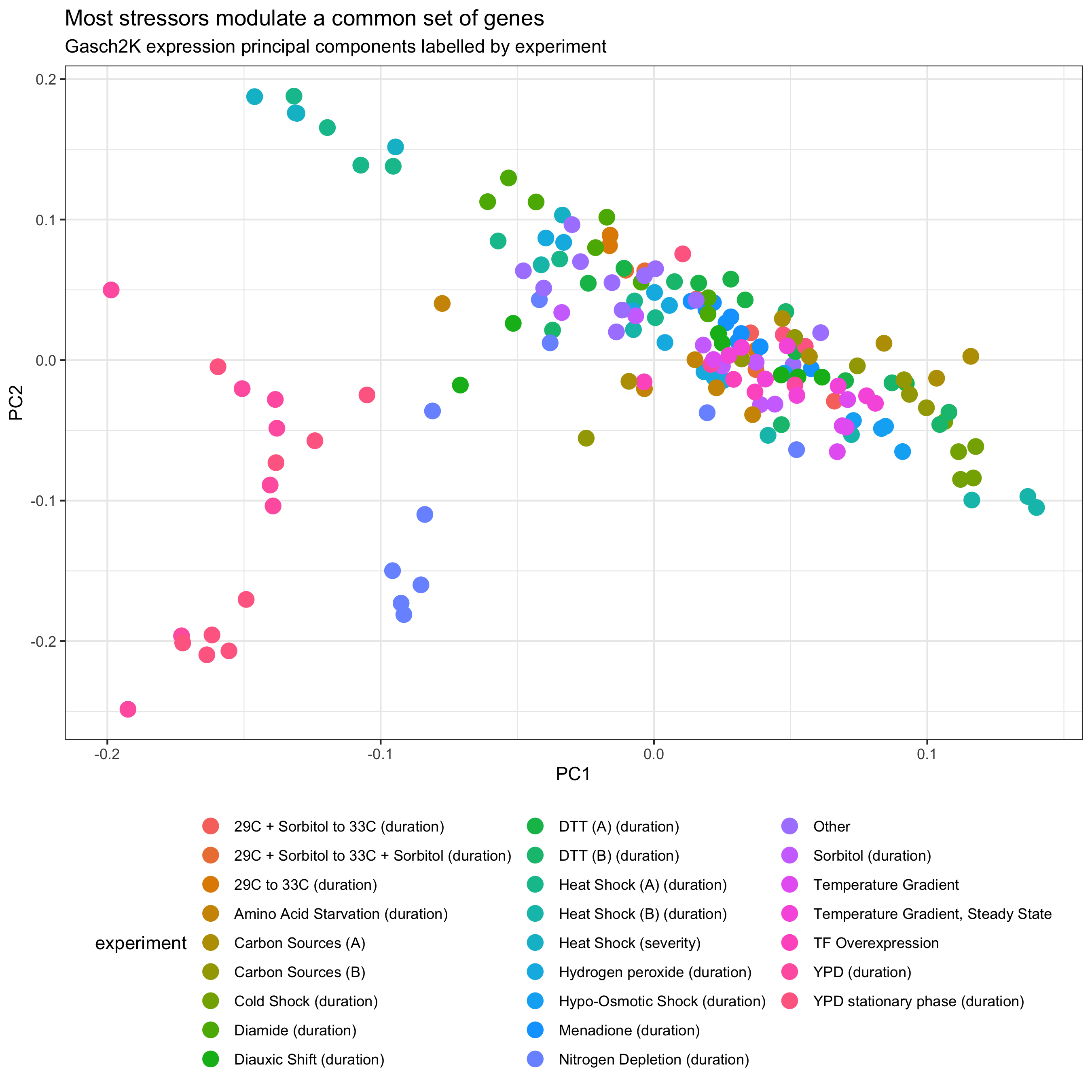
Based on this analysis we can see that most experiments cluster together aside from the “YPD” timecourses. These represent starvation conditions where the yeast clearly react with added measures beyond the ESR. Overlaying “experiment_order” and lassoing points to see them in a table using the interactive app, we can also see that samples are roughly ordered form less severe to more severe within the non-YPD conditions.
Heatmaps
While PCA allows us to summarize latent features of our dataset it is also helpful to view observation-level results in some format. This often involves plotting individual features but for genomics data it is common to also visualize the complete dataset using a heatmap. Heatmaps are essentially a visualization of a matrix of expression values (such as expression mean-centered by gene) with genes rearranged such that covarying genes are nearby one another. Samples may also be organized by similarity but frequently are organized by the experimental design. To order features and/or samples, hierarchical clustering is applied to create a tree linking all genes through successive merges of similarly behaving clusters of genes. The main parameters used when hierarchical clustering are a distance measure which defines how dissimilar all pairs of genes are, and the hierarchical clustering method which can affect the degree to which many small clusters or few large clusters are created. Generally it is important to choose a distance measure appropriate for your problem (here, Euclidean distance), while I generally don’t focus on the hierarchical clustering method (Ward.D2 is the default in romic). Both options are exposed whenever hierarchical clustering is performed in romic.
Shiny app
Heatmaps can be quite slow to render so to demo this function we can filter the Gasch2K dataset to a subset of conditions. To do this we’ll filter the samples table to a subset of experiments exploring the relationship between heat and gene expression.
# filter to a few experiments for the demo
heatshock_triple_omic <- imputed_triple %>%
  filter_tomic(
    filter_type = "category",
    filter_table = "samples",
    filter_variable = "experiment",
    filter_value = c(
      "Heat Shock (A) (duration)",
      "Heat Shock (B) (duration)",
      "Heat Shock (severity)",
      "Temperature Gradient"
      ))
Following the same deployment approach used above we can easily create a minimal Shiny app for helping us browse and explore heatmaps based on this dataset: Shiny romic heatmap. Since the app is ggplot2-based it is quite easy to add facets to organize samples.
Static Heatmaps
Once we find a nice view of our heatmap we can reproduce the results with a static visualization.
plot_heatmap(
  tomic = heatshock_triple_omic,
  cluster_dim = "rows",
  change_threshold = 3
) +
  facet_grid(~ experiment, scales = "free_x")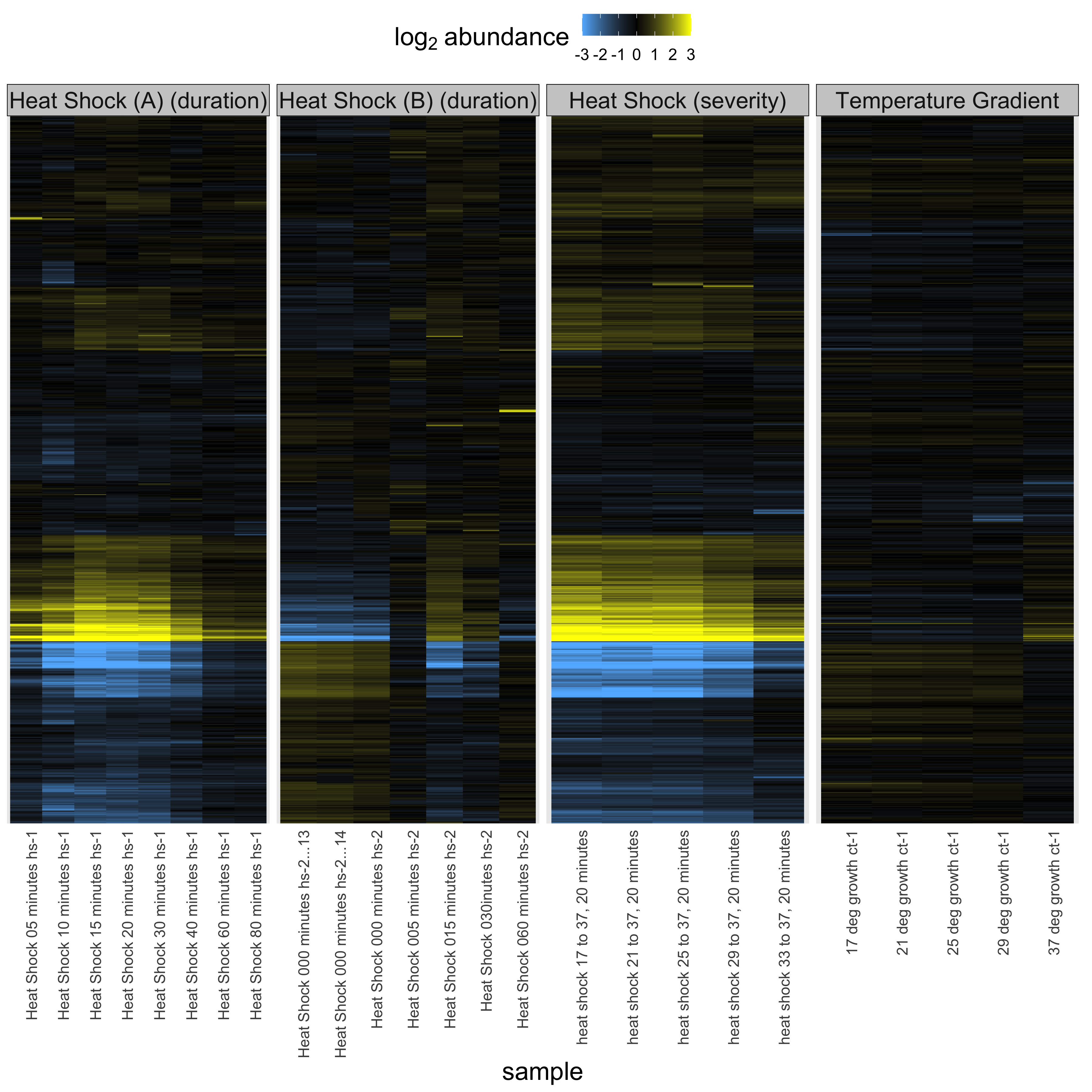
From this plot we can see when the yeast are most stressed out by heat and it is apparent that they respond to heat by turning up or down genes in a graded fashion to respond to both progressive and severe heat. Interestingly, the heat shock experiment stresses out the yeast transiently but by 80 minutes the stress has passed and the yeast have learned to leave with the elevated temperature. Yeast are tough.
Wrapping Up
Romic is built around a core data structure (the T*Omic) that efficiently tracks data and metadata as a dataset is filtered, mutated and reorganized during analysis. To enable this modulation, romic distinguishes feature-, sample- and measurement-level variables using a schema. An added benefit of this approach is that variables can be automatically mapped to feasible aesthetics during plotting. It wouldn’t make much sense to color by a measurement in a sample-level plot, nor to color a heatmap by a categorical variable. This property can be exploited with dynamic visualizations which map variables to feasible ggplot2 aesthetics.
- Share this on →


